
Learning Objectives
Following this assignment students should be able to:
- import, view properties, and plot a
raster- perform simple
rastermath- extract points from a
rasterusing a shapefile- evaluate a time series of
raster
Reading
-
Topics
raster- Raster math
- Plotting spatial images
- Shapefile import
- Integrate
rasterandvectordata
-
Readings
Lecture Notes
Exercises
-- Canopy Height from Space --
The National Ecological Observatory Network has invested in high-resolution airborne imaging of their field sites. Elevation models generated from LiDAR can be used to map the topography and vegetation structure at the sites. This data gets really powerful when you can compare ecological processes across sites. Download the elevation models for the Harvard Forest (
HARV) and San Joaquin Experimental Range (SJER) and the plot locations for each of these sites. Often, plots within a site are used as representative samples of the larger site and act as reference areas to obtain more detailed information and ensure accuracy of satellite imagery (i.e., ground truth).-
Generate a Canopy Height Model for each site (
HARVandSJER) using simplerastermath, wherechm = dsm - dtm. -
plot()thechmandhist()of canopy heights for each site on a single panel. Therasterpackage modifiesplot()from the basic Rgraphicspackage, so usepar(mfrow=c(2,2), mar=c(5, 4, 2, 2))prior to plotting to get the four figures on the same panel and to set margins to make labels visible. -
Add the
plot_locationsto the site images. Use theadd=TRUEargument in anotherplot()immediately proceeding plotting the site image to add the plot points.Don’t see the
plot_locationson the map??? Compare thecrs(chm)tocrs(plot_locations). HINT: They should be the same. -
Extract the maximum canopy heights for each plot at both sites within 10 meters of the center of the plot.
-
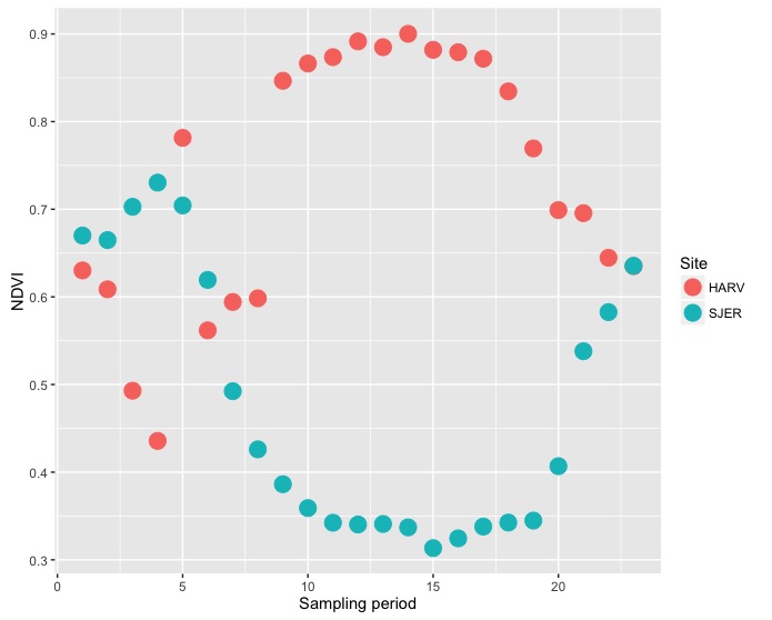
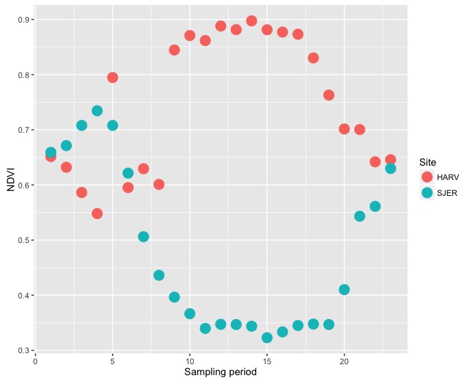
-- Phenology from Space --
The high-resolution images from Canopy Height from Space can be integrated with satellite imagery that is gathered more frequently. We will use data collected from MODIS. One common ecological process that can be observed from space is phenology (or seasonal patterns) of plants. Multi-band satellite imagery can be processed to provide a vegetation index of greenness called NDVI. NDVI values range from
-1.0to1.0, where negative values indicate clouds, snow, and water; bare soil returns values from0.1to0.2; and green vegetation returns values greater than0.3.Download
HARV_NDVIandSJER_NDVIand place them in a folder with the NEON airborne data. Thezipcontain folders with a year’s worth of NDVI sampling from MODIS. The files are in order (and named) by date and can be organized implicitly by sampling period for analysis.- Plot the whole-raster mean NDVI (
cellStats()) for Harvard Forest and SJER through time using different colors for the two sites. - Plot the mean NDVI of the
plot_locations(extract()) for Harvard Forest and SJER through time using different colors for the two sites. - Describe the differences in vegetation structure (
chm) from Canopy Height from Space and seasonal phenology (NDVI) that you observe in this analysis in a comment. Also, describe the impact of the different mean calculations on the analysis.
Optional challenge: Extract
[click here for output] [click here for output]sampling_dayfrom the NDVIfile_nameand include that with yourdata.framefor graphing.- Plot the whole-raster mean NDVI (