Data Carpentry for Pharmacists
Teaching the tools to get computers to do cool science

This is a follow up to Adult vs Newborn Size.
We’ve graphed the relationship between adult size and new born size in mammals and now it’s time to analyze the relationship statistically.
ggplot make a graph that shows both the data points and the
regression line through those points. Either the axes or the data should be
logarithmically scaled to match your regression analysis. You won’t actually
need to include the regression results themselves since geom_smooth will
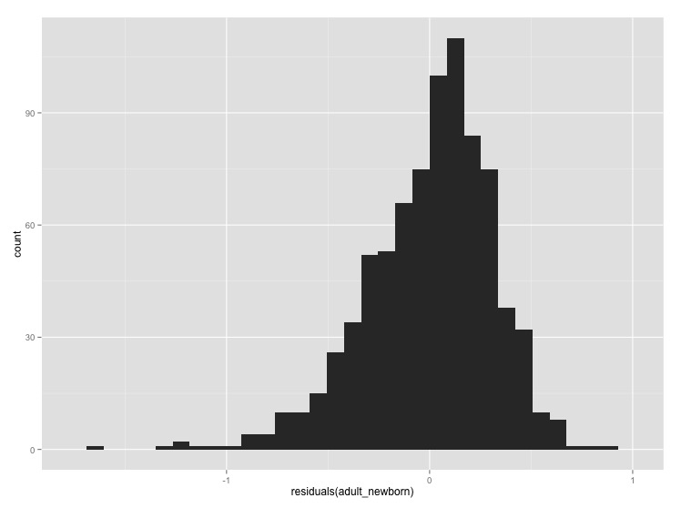
let you graph the linear model with the data. Label the axes.Optional: If you want, plot a histogram of the residuals of the regression to make sure that they are roughly normally distributed (you can do this with just a single line of code)
[click here for output] [click here for output] [click here for output]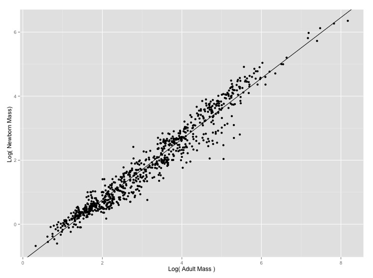