Data Carpentry for Pharmacists
Teaching the tools to get computers to do cool science

This is a follow up to Sexual Dimorophism Exploration.
Having done some basic visualization of the Lislevand et al. 2007 dataset of bird size measures you realize that you’ll need to do some data manipulation to really get at the questions you want to answer.
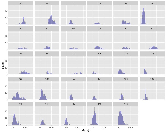
In Sexual Dimorophism Exploration you created a plot of the histograms of female and male masses by family. This resulted in a lot of plots, but many of them had low sample sizes.
The following code creates a data frame with a column of Family IDs and a column of the number of species in the associated family that have non-null masses for both males and females.
 large_n_families <- data %>%
   filter(!is.na(M_mass), !is.na(F_mass)) %>%
   group_by(Family) %>%
   summarize(num_species = n())
Modify this code so that the resulting data frame only includes families with more than 25 species, and add a comment to the top of the block of code describing what it does.
Now join this with your original data to get the subset of your data with more
than 25 species in each family. inner_join() only keeps rows where the joining
field(s) occur in both tables, so since you’ve already removed families without
a lot of species from large_n_families, they will be removed from the resulting
data frame.
Now, remake your original graph using only the data on families with greater than 25 species.
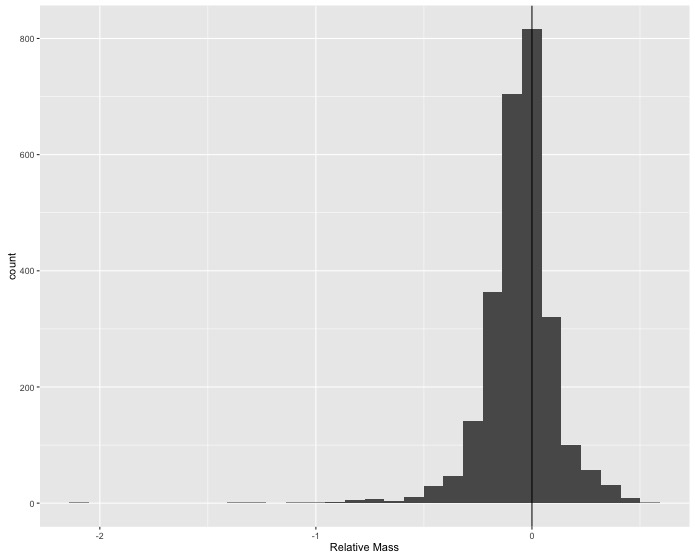
Sexual size dimorphism doesn’t seem to show up clearly when visually comparing the distributions of male and female masses across species. Maybe the differences among species are too large relative to the differences between sexes to see what is happening; so, you decide to calculate the difference between male and female masses for each species and look at the distribution of those values for all species in the data.
Use mutate() to create a new column which is the relative size difference
between female and male masses
(F_mass - M_mass) / F_mass
and then make a single histogram that shows all of the species-level differences. Add a vertical line at 0 difference for reference.
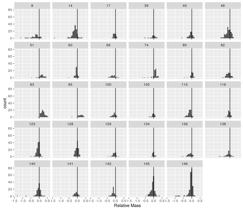
Combine the two other tasks to produce histograms of the relative size difference for each family, only including families with more than 25 species.